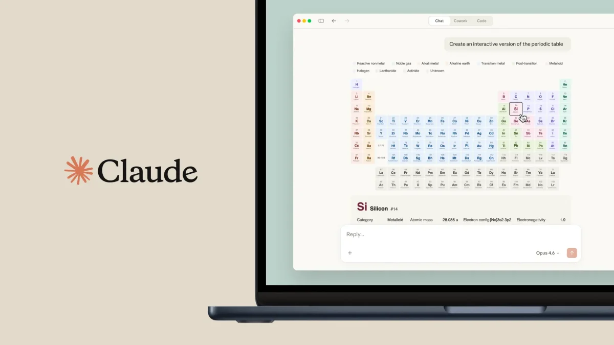
Claude has officially added a new, powerful feature that lets the AI turn hard-to-understand datasets into charts and diagrams you can interact with. Users can now see patterns and trends more easily without having to make spreadsheets or use design tools from other companies. This makes it much easier to see and use information.
Claude adds this visualization feature to its text-based answers, which makes data analysis more complete. This change makes sure that your data is not only read but also fully visualized. This capability is important for making big decisions, whether you are a student or a professional.
How Claude transforms raw data into visual insights
The new functionality is powered by what Anthropic calls an “analysis tool.” According to Engadget, this tool allows the AI to write and execute JavaScript code in a secure environment to process data and create visuals. This means that when you upload a file like a CSV or paste a large table of numbers, Claude can instantly turn that raw information into a bar graph, a pie chart, or even a complex flow diagram.
This update represents a significant shift in how users interact with the platform. Instead of just getting a summary of a document, you can now ask Claude to “show” you the results. According to reports from The Verge, this feature is designed to compete directly with other advanced AI models that offer data analysis. By keeping the code running in the background, the system ensures the user experience remains simple and intuitive, even when handling very complex mathematical tasks.
The main advantages of using Claude for data visualization
Data visualization is the process of turning numbers into visuals people can see, such as graphs or maps, to make the information easier to understand. This ability is a skill that will always be useful because people naturally process pictures much faster than long lists of numbers or words. Claude simplifies a task that was previously quite difficult. Anyone can act like a data scientist with just a few hints, which can guide users in interpreting data effectively and using visualization tools to derive meaningful insights. These new visualization tools have a lot of great features, such as:
- Instant Accuracy: Claude lets you spot outliers and trends in your data without needing to comb through every single spreadsheet cell.
- Interactive Elements: Hover over data points in Claude’s charts to see more details and specific values.
- Improved Communication: Quickly generate diagrams to clarify intricate project timelines or workflows, which you can then share with your team.
- Save time: Let Claude handle the layout and design, freeing you from hours of chart formatting in traditional software.
It’s always important in business and tech to see data visually. As more information becomes available, the tools we use to sort and display it must improve. Claude ensures it will remain a useful and relevant tool for anyone who has to deal with modern data problems by adding these features.

Q: What kinds of graphs can Claude draw?
There are many different types of graphs that Anthropic can make. These include line graphs, bar charts, scatter plots, and pie charts. It can also make flowcharts and organizational charts that help people understand how things work.
Q: Do I need to know how to code to use these features in Claude?
You don’t need to know how to code. You can either give Anthropic the information or upload a file, and he will write the code to generate the visual in the background.
Q: Can you send the charts that Anthropic made to another person?
You can usually click a chart or diagram that Anthropic makes, or take a picture of it, to use in your reports, documents, or presentations.
In conclusion, the platform is even more important for anyone who wants to use Claude to make complex information easier to understand, thanks to its built-in data visualization tools.