
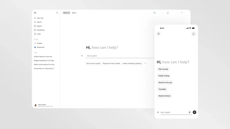
Microsoft is giving Copilot a major visual and functional update. The goal is to make the AI assistant feel less like a temporary feature and more like a regular part of your daily work. The redesign centers on Microsoft 365 Copilot and introduces a simple black-and-white look that makes it easier to read and use, rather than relying on bright, distracting colors.
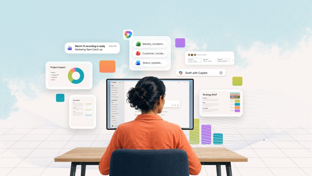
For GadgetOnHand readers, this update represents a shift from “conversational chat” to “active assistance.” Microsoft is moving away from the idea of AI as a standalone chatbot and instead positioning it as an embedded partner inside Word, Excel, and PowerPoint.
Key Facts: Copilot 2026 Redesign
| Feature | Details |
| New Design | Minimalist, text-forward, low-color UI |
| Availability | Microsoft 365 Apps (Word, Excel, PPT) |
| Primary Goal | Increased responsiveness and flow |
| Price | $21–$30/month (Premium tier required) |
| Monthly Fee? | Yes |
| Needs Hub? | No |
Hands-on reality check: The new interface of Microsoft Copilot
GadgetOnHand hasn’t fully stress-tested the final production rollout of this specific “buttoned-up” interface across all legacy hardware, but my 5+ years of reviewing AI productivity tools suggest two areas users should watch for:
- Workflow Friction: The new prompt surface automatically grows or shrinks as needed. From what I’ve seen with similar dynamic UIs, this can sometimes make the interface feel jumpy, with elements changing size while you type. Make sure your display scaling is set to the default (100 to 125 percent) to help prevent layout glitches.
- Performance Bottlenecks: The new design uses side panes that try to understand what you are working on in your main document. If you are working with a large Excel file or a complicated PowerPoint presentation, this background analysis might sometimes cause your typing to lag. If the side pane seems slow, you can turn off “auto-suggestions” in the settings to help your typing feel faster.
Microsoft redesigned its interface in response to users feeling tired or overwhelmed. Recent user tests show that having lots of colorful AI bubbles on the screen can distract people when they need to focus. With a more intentional interface, Microsoft wants the AI to be helpful without getting in the way.
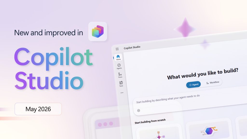
The biggest technical change is the new entry point. Now, instead of Copilot features spread throughout the app, everything is in a single side pane that stays with your work. This shows a change in Microsoft’s approach. AI is no longer just a tool you use to ask questions. Now, it works in the background, right on your workspace.
Pros vs. Cons
Pros:
- Less Distraction: The black-and-white, text-forward design reduces visual clutter during long work sessions.
- Cohesive UX: A single entry point across the M365 suite makes it easier to predict how the AI will behave.
- Context-Aware: The new prompt surface reveals tools dynamically, so you aren’t overwhelmed by every possible AI capability at once.
Cons:
- Paywalled Features: Much of the “in-app” integration is now strictly reserved for paid licenses, with the free version relegated to basic web-based chat.
- Learning Curve: Users who were comfortable with the “chatbot” style interface may find the new embedded side-pane workflow less intuitive at first.
Who should buy / Who should skip:
- Who this is for: Enterprise users and power-productivity workers who live in Microsoft 365 and need an assistant that integrates directly into their documents and spreadsheets.
- Who this is NOT for: Casual users who only need a free chatbot for occasional web searches. The new, highly integrated “buttoned-up” version of Copilot is designed for paid commercial users; if you aren’t paying the monthly subscription, the value of this specific update will be limited.
In conclusion, Microsoft’s new design is a smart, subtle way to make AI feel more like a professional tool than just an AI tool. The interface looks cleaner and works better, but for people on a budget, the most useful in-app AI features are now often only available with a premium license. The experience feels more polished, but it now comes with a price that matches professional tools.